
But the title of this post is about what happens when I try to copy someone elses post-processing style. I copied the editing style of Brenda Acuncius over at F8 Kids. She is one of the instructors of the Bloom Photography Workshop that I am taking. I absolutely adore her work. You'll see below that in the picture of Noah with the hat, that the edits just doesn't work. I actually like the SOOC best. The edit looks "muddy" for this photo and doesn't convey the "sweetness" of the SOOC shot. I am not saying that the editing style used is a bad one, just that it doesn't work for this picture and that each person has to find their own style, obviously I am still in search of mine but getting closer (see next set of pictures).
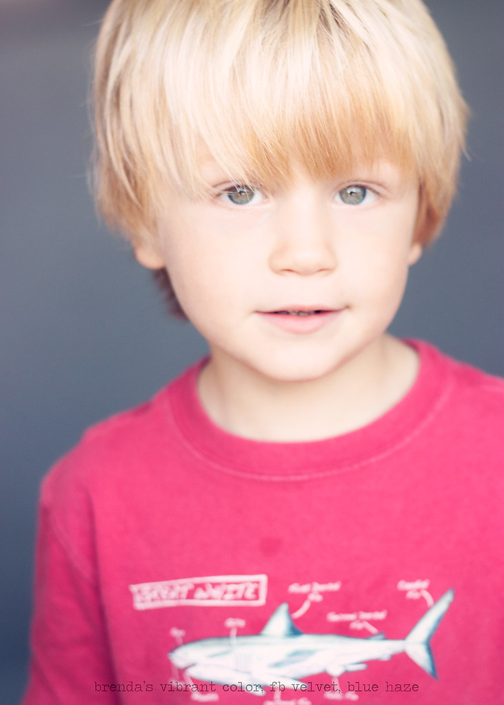
The second edit is another picture of Noah, where he decided it was time for a wardrobe change. Just for information we got his hair cut later that afternoon. I already miss those golden locks. The edit on this photo is much more my style...color, but a bit subdued, but not desaturated. I don't know if that makes ANY sense to anyone but me. Oh well!
The point of this post, is that I like it when I can turn something around in my brain. I had it in my brain that Brenda's post-processing style looks great all the time. Truth is it does, but on her photos with her style applied to it. I have to find my own style for my photos and for the style of photos that I take. Seems like I should have already known this little tidbit, but for me it took some experimentation.
SOOC:

Edit: Brenda's Color, Urban, Pink Haze, Vignette, Crop, Sharpen

SOOC:

Edit: Brenda's vibrant color, FB Velvet, Blue Haze, Vignette, Crop, Sharpen


They still do look great! I really love the edit of the 1st one. his face is sharp and the rest has that haze. Great work!!
ReplyDeleteThe only CC i have for the 2nd one is that the focus seems to be on his lips or nose.
I do ADORE the skin tones. I wish I could produce images like that!
These are gorgeous. Super lovely.
ReplyDelete